Case study · 02 Healthcare dashboards Enterprise UX · 2018–2023 Hologic · Quidel · & more Case study · 02 Healthcare dashboards Enterprise UX · 2018–2023 Hologic · Quidel · & more
Case Study · No. 02
2018 — 2023 · Enterprise healthcare UX
Healthcare · Enterprise · Real clients

Designing for healthcare's real users.

Two healthcare clients, two very different briefs. Hologic needed a field-services portal for engineers who fix lab equipment. Quidel needed a complete redesign of the territory tool their sales team had given up on. Both came down to research, judgment, and care for the user.

Role
UX Designer
& Researcher
Clients
Hologic, Quidel,
& others
Period
Multiple projects
2018 — 2023
Showing
2 representative
case studies
Trusted by Hologic Quidel + healthcare partners
01 — The short version

What healthcare UX really demands.

Healthcare interfaces aren't designed for delight. They're designed for clarity under pressure — for clinicians, technicians, and engineers who need the right information in seconds.
01

Real healthcare clients. Worked with Hologic and Quidel — global names in diagnostics — alongside other healthcare projects. Each project came with NDAs, regulated environments, and demanding stakeholders.

02

Expert users, not consumers. Field service engineers, lab technicians, clinicians. People with no time for friction, no patience for ambiguity, and zero tolerance for visual noise.

03

Data-heavy interfaces. Hundreds of devices, real-time status, geographic distribution, priority hierarchies. The job was turning enterprise data into actionable, scannable, non-negotiable visual systems.

04

Research, not just design. Every project started with user interviews — field engineers, technicians, operators. Personas, journey maps, and usability testing weren't optional. The screens are the easy part.

02 — Project 01
Client Hologic

Field Services Portal.

A monitoring and work-order platform for Hologic's field service engineers — built to consolidate disparate tools and let engineers proactively address device issues across hundreds of healthcare sites.
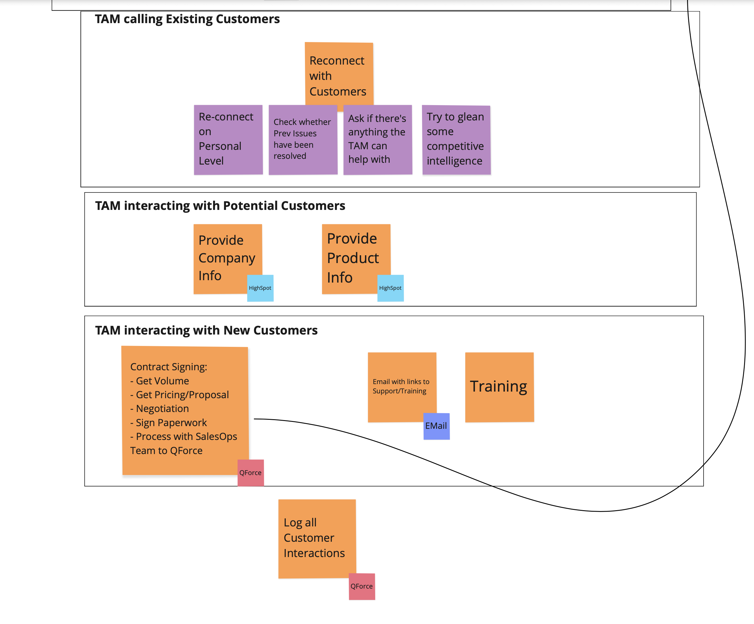
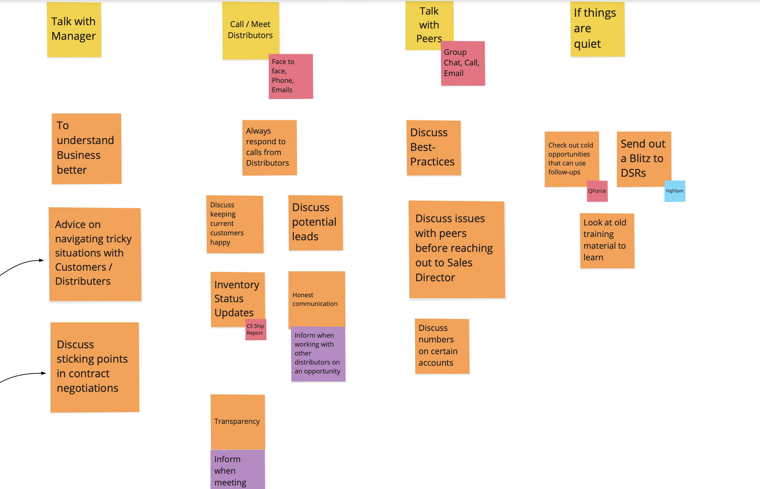
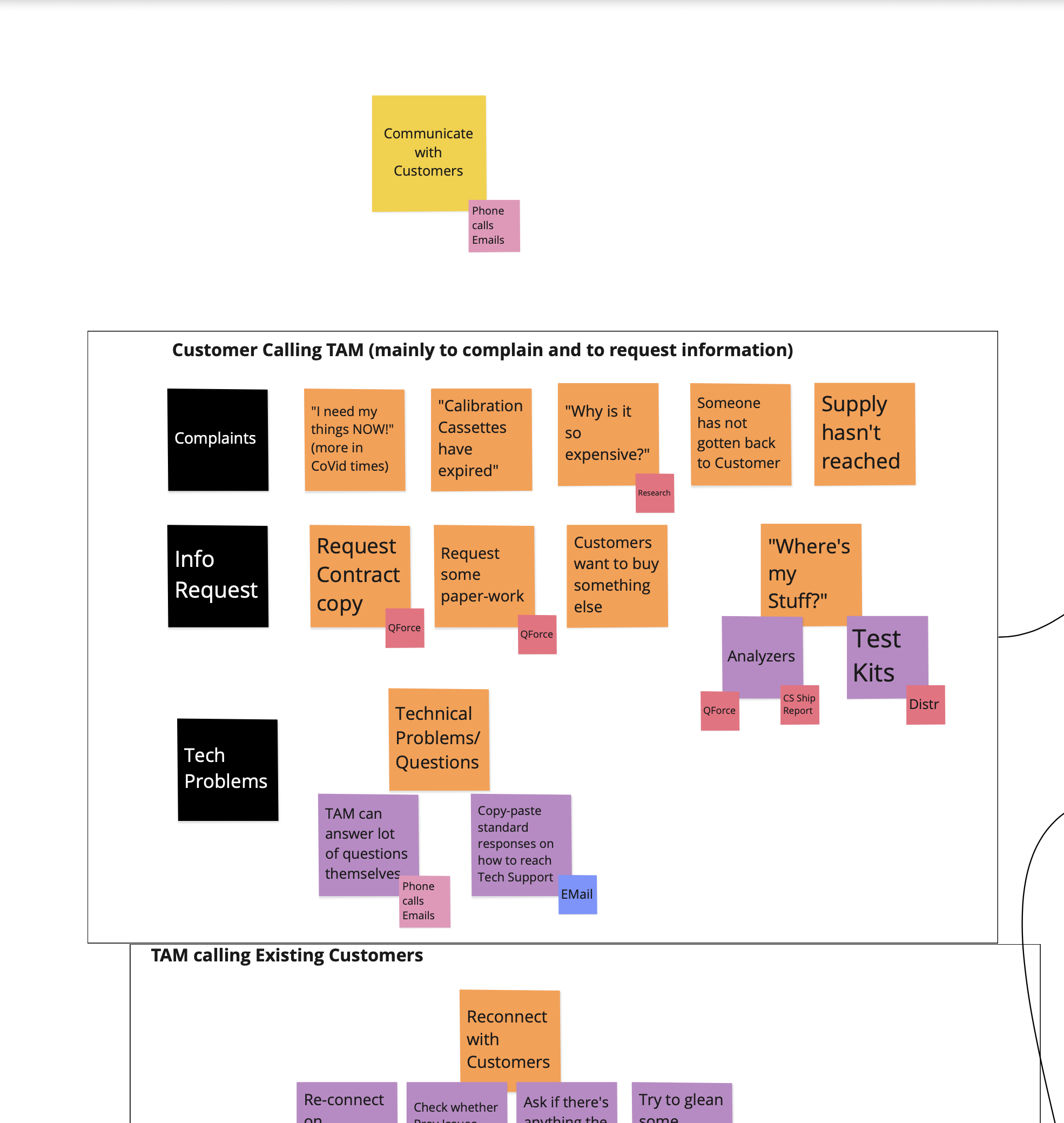
Enterprise UX User research Personas Dashboard design Admin panel Real-time data
My role
Lead UX designer
Scope
Portal, Dashboard,
Admin Panel
Users
Field Service
Engineers (FSEs)
Research
User interviews
over 5 days
i.

Discovery

Audited the existing tool landscape — disparate systems, manual workflows, no single source of truth for FSEs in the field.

ii.

User research

Wrote an interview script focused on values and motivations. Conducted multiple remote interviews over 5 days with the target audience.
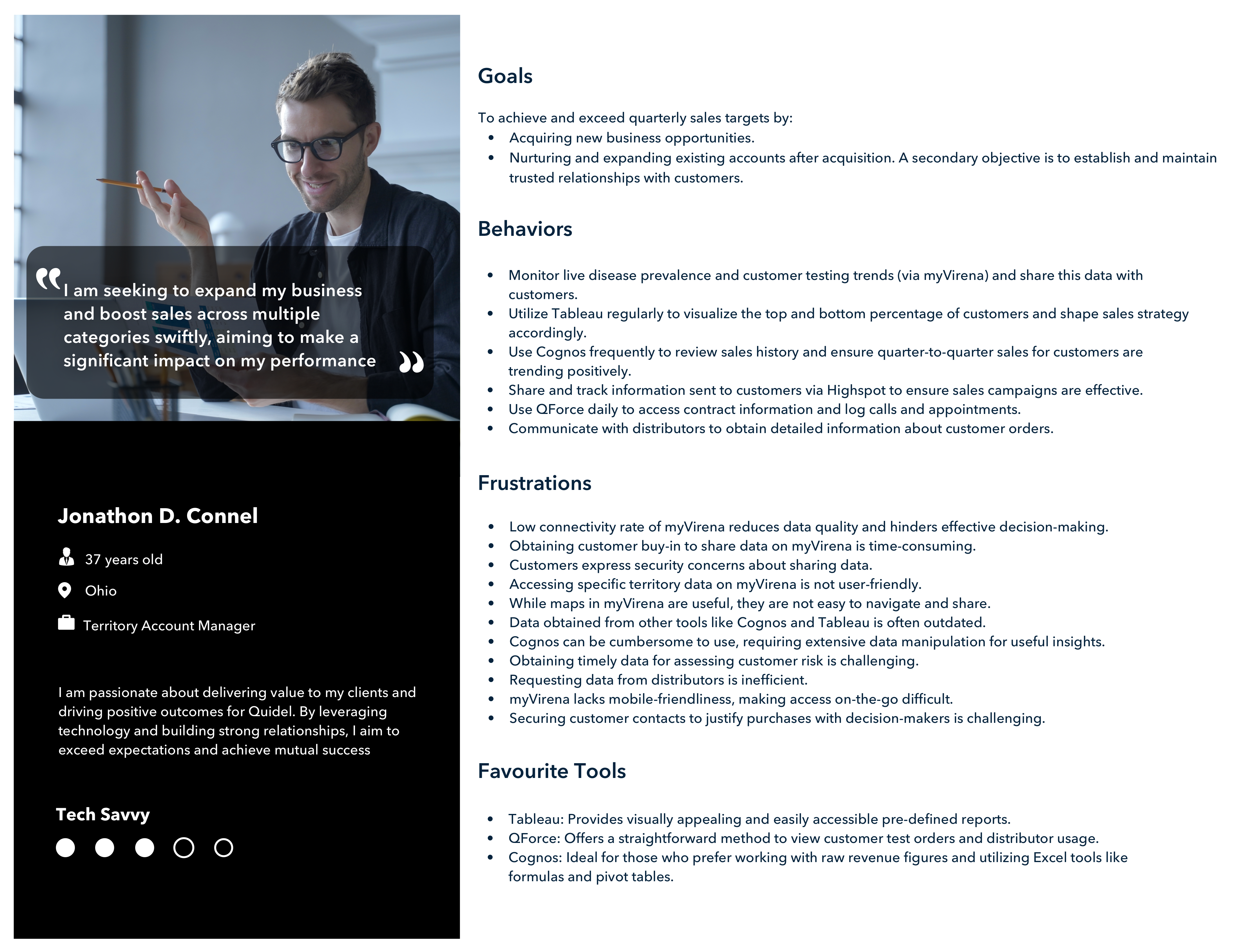
iii.

Personas & design

Synthesized insights into personas, then designed the Portal, FSE Dashboard, and Admin Panel — collaborating with developers throughout for feasibility.

iv.

Iteration

Iterated on designs based on engineering feedback and continued user input. Research insights served as a reference point throughout.

Field Service Engineer Dashboard — map view showing device distribution across the US
Geographic distribution.
View 01 / 03 — Map view

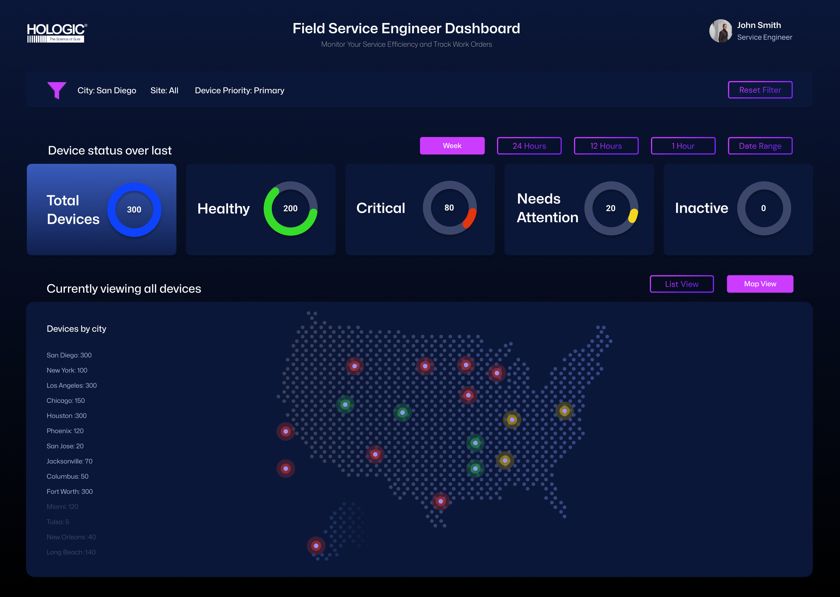
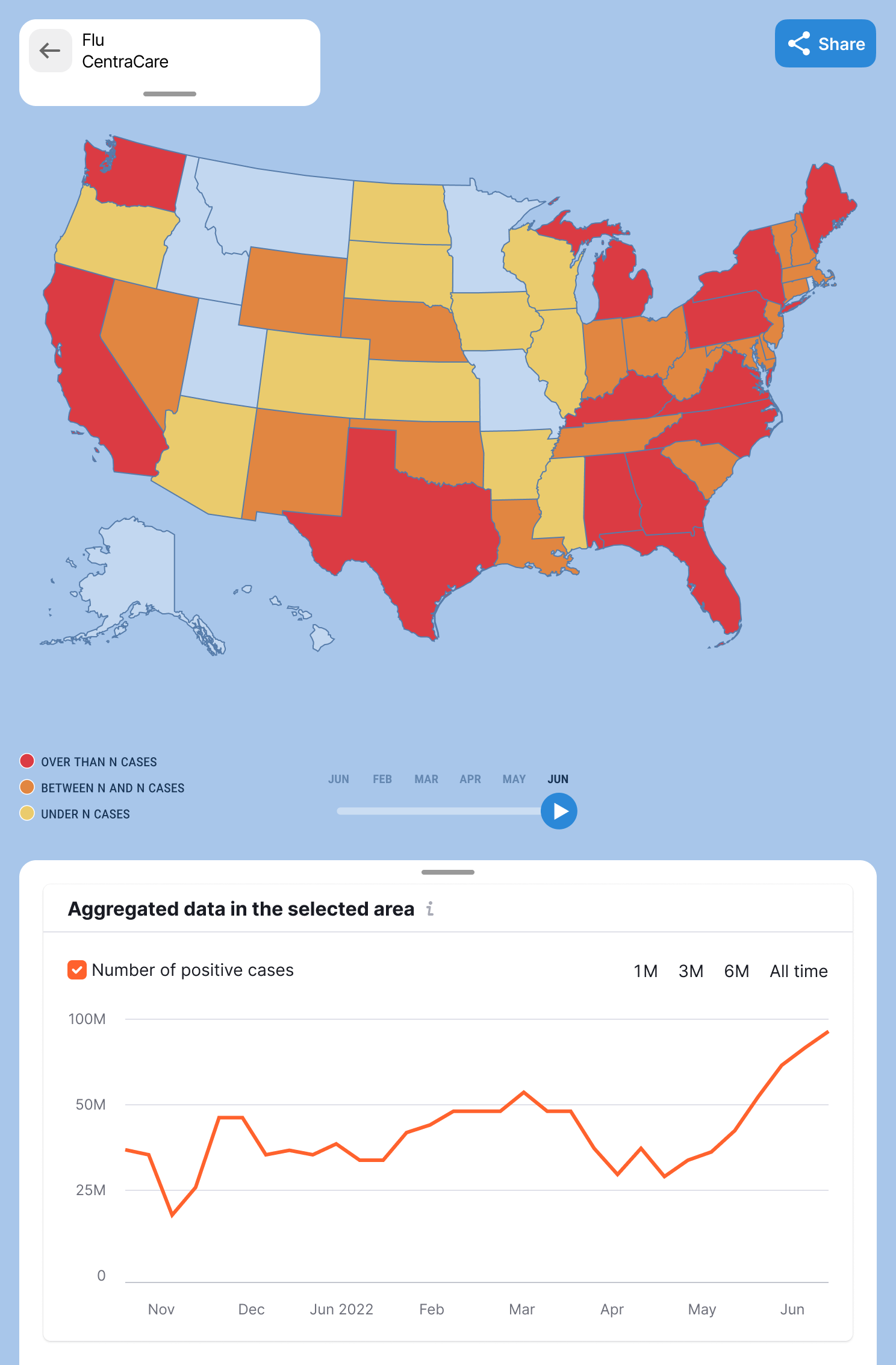
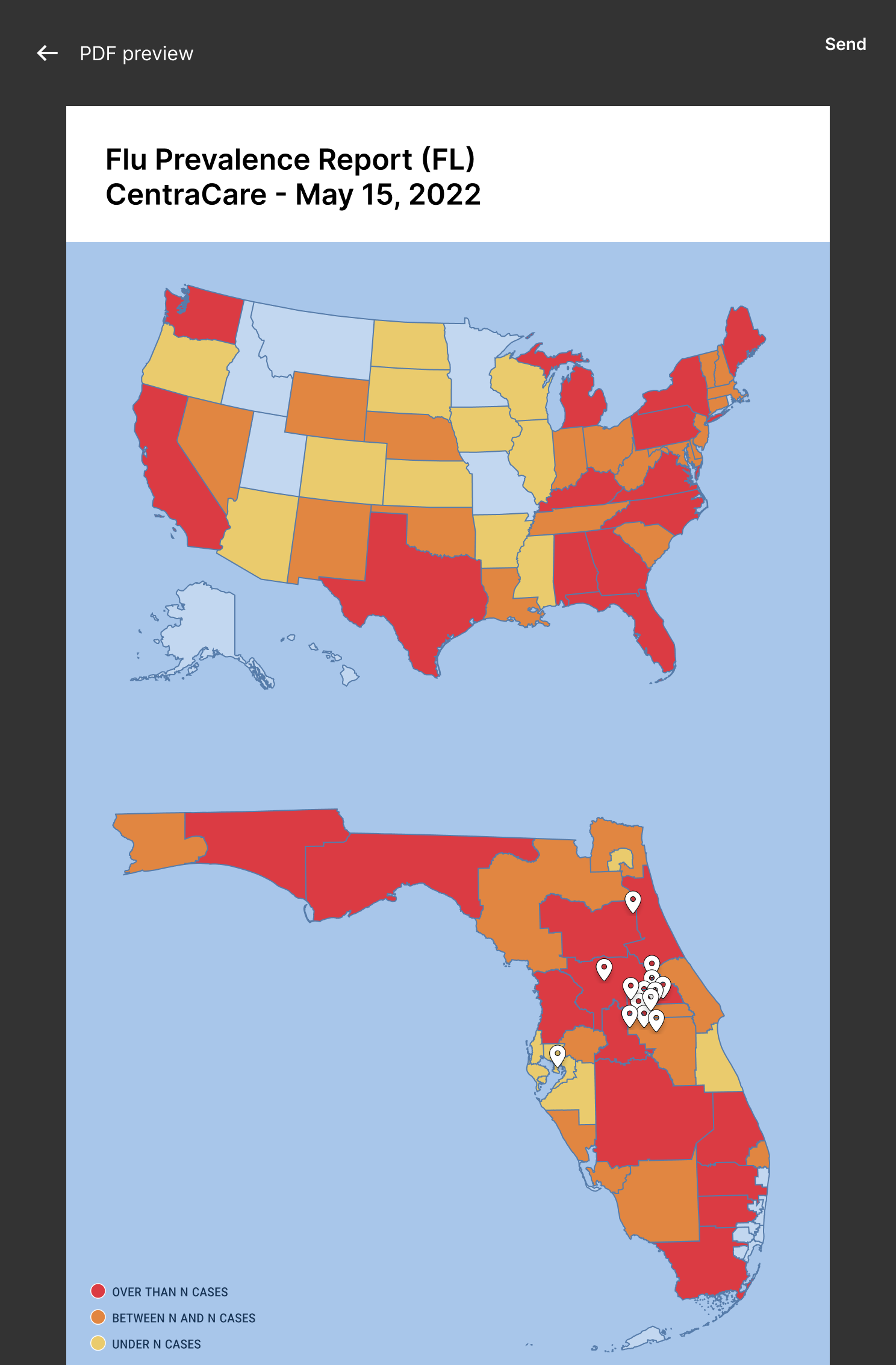
The Map View answers a question every FSE asks first: where are my devices, and which ones need attention right now? Color-coded status indicators (red for critical, yellow for warning, green for healthy) plot device locations across the US, with a city-level breakdown on the left for quick triage planning.

Field Service Engineer Dashboard — list view of device records (redacted for client privacy)
Device records, at scale.
View 02 / 03 — List view (records redacted)

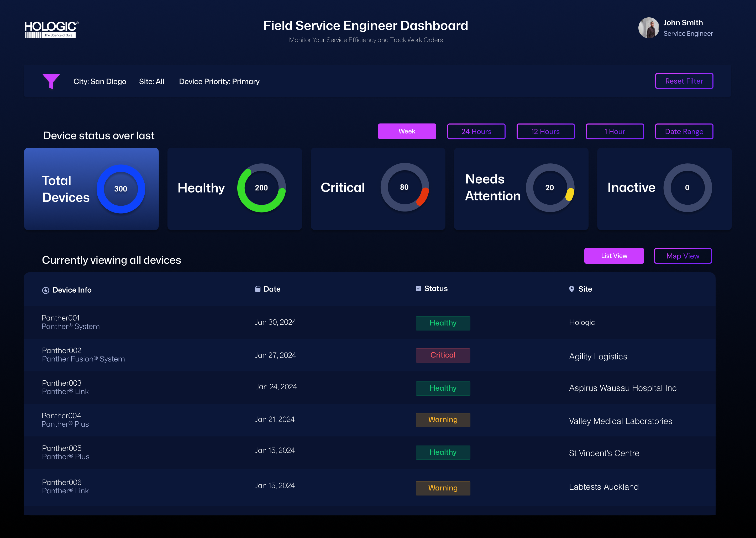
The same data, viewed differently. Status-over-time charts at the top — Total, Healthy, Critical, Needs Attention, Inactive — give engineers a system-level pulse before they drill down. Time-window filters (Week / 24h / 12h / 1h) let them shift between long-range planning and right-now triage. Device records are blurred to protect client privacy — the layout and design system are the work; the data belongs to Hologic.

Field Service Engineer Dashboard — filter panel with location, device, and date range options
Filtering at enterprise scale.
View 03 / 03 — Filter panel

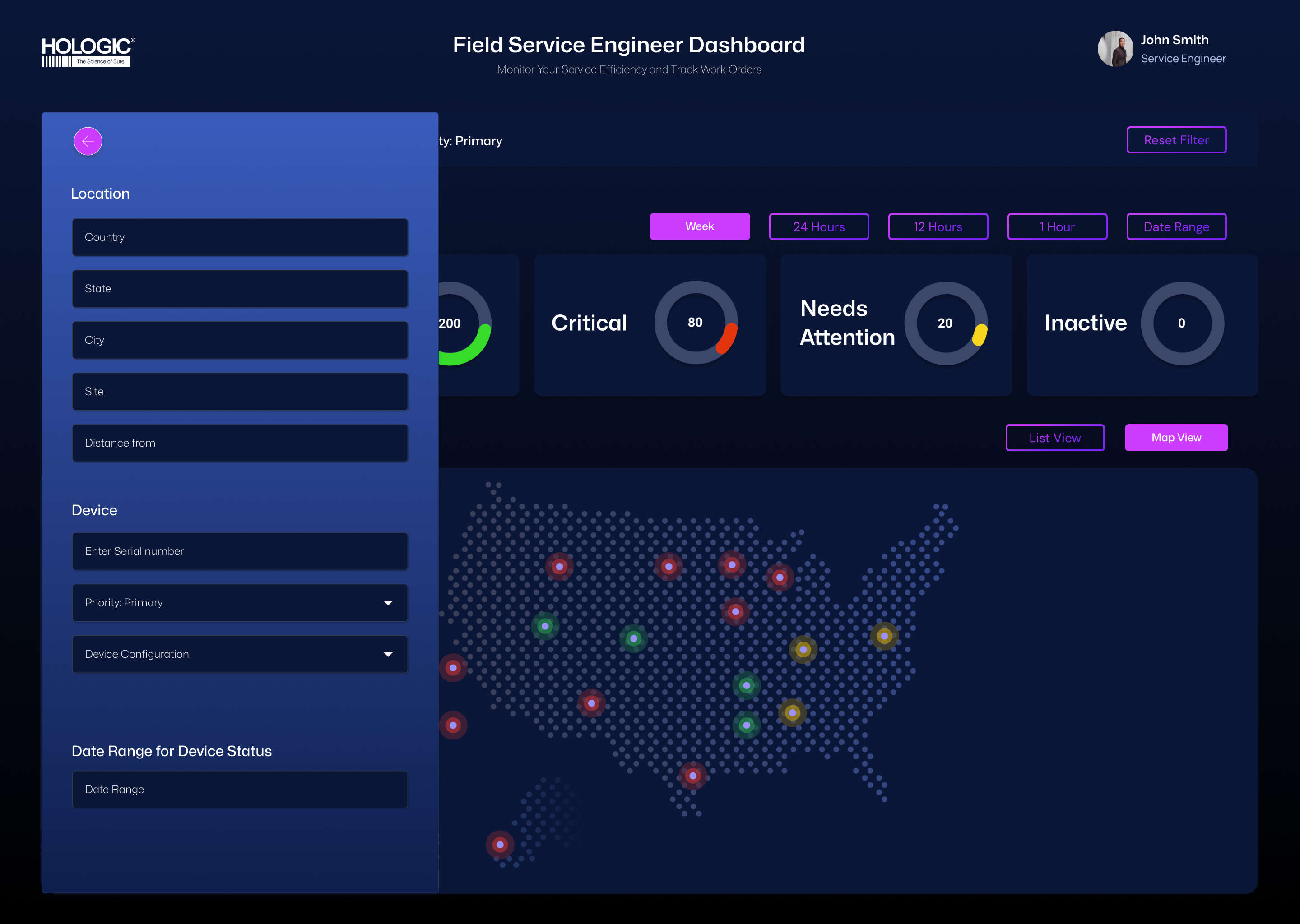
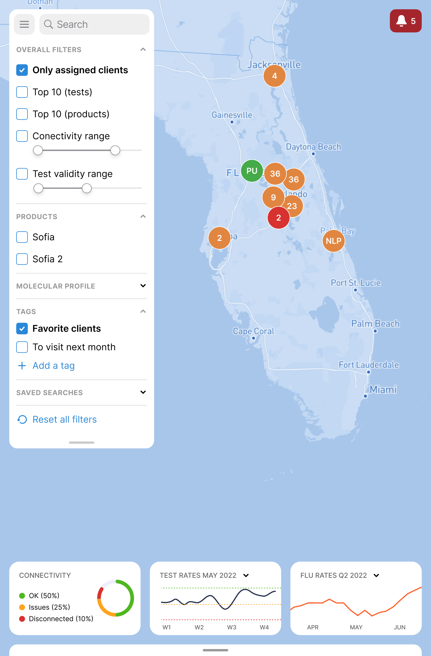
With hundreds of devices in play, filtering isn't a feature — it's the product. The slide-out filter panel groups controls into Location, Device, and Date Range, with sensible defaults (Priority: Primary) so engineers can get to a clean view in two clicks. The whole panel was designed to be keyboard-navigable for field engineers working hands-busy.

01.
Two views, one truth

Map and list views share the same status logic and color system, so engineers can switch perspectives without recalibrating.

02.
Color earns its meaning

Red is reserved for critical only. Yellow for warning. Green for healthy. No decoration. In healthcare, color is a signaling system, not a styling choice.

03.
Status charts up top

Donut charts at the top of every view answer "what's the situation?" before a single record is loaded — saving FSEs scanning time on every visit.

03 — Project 02
Client Quidel

myVirena — reimagined.

A complete redesign of myVirena, Quidel's territory-management platform for sales teams in the field. The brief was simple, the work was not: take a tool TAMs barely tolerated and build the one they actually want to open.

User research Personas Journey mapping Affinity diagramming Mobile-first redesign Data visualization Map UX
My role
UX Designer
& Researcher
Users
Territory Account
Managers (TAMs)
Domain
Diagnostics
field sales
Output
Mobile-first
territory app
Real tools in TAMs' workflow Tableau Cognos QForce BadgerMap Highspot myVirena
01 — The problem

The tool that should have helped wasn't helping.

Quidel's TAMs are responsible for entire US territories — driving, calling, visiting customers, chasing distributors, and hitting quarterly targets. They had myVirena, the official platform. But in interviews, the picture was clear: they barely opened it.

They were stitching their day together with five other tools — Tableau for charts, Cognos for raw revenue, QForce for contracts and call logs, BadgerMap for visit planning, Highspot for sales materials. myVirena should have been the home base. Instead, it was the tool they avoided.

"Maps are useful, but they're not easy to navigate and share. Accessing specific territory data isn't user-friendly. And it's not mobile-friendly — I can't use it on the go."
— Composite TAM feedback from interviews
myVirena login screen
Login — the only screen TAMs all agreed worked
02 — Discovery

Affinity diagramming: find the patterns.

I started with interviews — open-ended conversations with TAMs about how they actually spent their day. Not what the org chart said they should do. What they actually did between 8 AM and 6 PM, in the office and on the road.

Then I clustered the raw data. Sticky note by sticky note, behavior by behavior, until patterns emerged: "Talk with Manager," "Call Distributors," "Talk with Peers," "If things are quiet." Each cluster came with the tools TAMs reached for in that moment — Tableau, QForce, Highspot, BadgerMap.

This is the part of the work AI can't do. The clusters didn't exist before the interviews. They emerged from listening — and from being willing to throw out my first three groupings before the right ones surfaced.

Affinity diagram clusters: Talk with Manager, Call Distributors, Talk with Peers, If things are quiet
Affinity diagram — clustered behaviors and tools by mode of work
03 — Synthesis

The day, mapped end to end.

I synthesized the clusters into a journey map: a TAM's day in the office, broken down by the kinds of conversations and actions they handle. Customer calling TAM (complaints, info requests, tech problems). TAM calling existing customers (reconnect, check on issues, glean intel). TAM with potential customers. TAM with new customers (contracts, training, onboarding).

Each branch came with the tools they used and — more importantly — the moments where the tools failed them. Where they had to alt-tab to Tableau because myVirena couldn't show the chart. Where they had to copy-paste from Cognos because the data was stale. Where they had to call a distributor because the system didn't have inventory status.

The journey map became the design brief. Every place where a TAM had to leave myVirena was a feature gap. Every moment of friction was a redesign target.

Journey map detail: weekly planning behaviors connected to specific tools (Tableau, Cognos, QForce, BadgerMap, EMail)
Journey map — weekly planning side, with tool annotations
Full TAM journey map — TAM is in the Office, with all clusters of activity, customer calls, and connections to tools
The full journey map — TAM in the office, in the field, on the phone, between the apps
04 — Persona

Meet the real user.

Synthesized from the interviews — a composite TAM. Specific frustrations from real conversations. Specific tools from real workflows. Specific goals tied to actual quarterly targets. This persona drove every screen-level design decision that followed.

Composite TAM persona — Territory Account Manager, 37, Ohio. Goals, behaviors, frustrations, and favourite tools. Photo blurred for privacy.
Composite persona · stock photo blurred for privacy
05 — Design direction

Mobile first, finally.

The biggest finding from research wasn't subtle: TAMs live on the road. They check data between meetings, in parking lots, in airports. The legacy myVirena was desktop-only. That single architectural decision was the reason they reached for other tools.

The redesign started from a phone screen. Every flow had to work in one hand, in landscape transit, with thumb-only input. If a screen needed two hands or a desktop, it was wrong.

Login set the tone — minimal, clean, fast. No corporate noise. The tool earns its place by being instantly useful, not by demanding ceremony.

Login screen — minimal, fast, mobile-first
06 — Map as home base

The map is the territory.

TAMs think in geography. "How's Florida doing this quarter?" "Where are my biggest accounts in the southeast?" "Which clients haven't I visited in 60 days?" These questions are spatial first, data second.

The new map view is the home screen. State-level color coding for flu prevalence. Cluster pins for client density. A time scrubber that lets TAMs play the last 12 months as an animation — watching outbreak patterns roll across the country and timing their outreach to the data.

When they tap a state, the view zooms in. Florida becomes Florida. The clusters become individual clinics. The data becomes actionable. The map isn't a feature. It's the navigation system.

US-level map view with flu rate forecasting and time scrubber
US map with PDF share/export overlay
Share — PDF report export
State-level Florida map with client filters and clustered pins
State view — Florida + filters
Client overview screen — connectivity, test rates, stock, notes
Client overview — full snapshot
07 — Client snapshot

Everything a TAM needs, before the call.

One of the most-cited frustrations: TAMs would call a customer with stale data because pulling fresh numbers required four tools. So I designed a single client view that pulls together what they actually use mid-call — connectivity status, test rates over time, stock overview, contact info, and notes from previous visits.

The Notes section is unglamorous but powerful. "Schedule a visit for next month." "We discussed and solved the invalid test issues." These are the breadcrumbs that turn a sales rep into a trusted partner. The old tools made TAMs keep these in their heads or in personal notebooks. The new design makes them part of the customer record.

A separate Molecular Profile tab catalogs which diagnostic devices the client owns — Cepheid GeneXpert, Hologic Panther, BD Max, Roche Liat. TAMs can talk competitively without scrambling.

Client molecular profile — grid of diagnostic devices the client uses
01.
Research before screens

Six steps of synthesis — interviews, affinity, journey, persona — happened before a single pixel was placed. The screens are downstream of the thinking.

02.
Mobile-first redesign

The biggest unlock was architectural, not visual. Moving from desktop-only to mobile-first eliminated the single biggest reason TAMs avoided the legacy tool.

03.
Maps as navigation

For users who think in territories, the map isn't a visualization — it's the home screen. Zoom from country to state to client without leaving the spatial mental model.

04 — What healthcare taught me

Lessons that travel everywhere.

Working in healthcare didn't just sharpen my dashboard chops. It changed how I think about every interface I touch.

i.

Stakes change everything.

When a missed alert can cascade into a missed diagnosis or a delayed repair, every visual decision is a safety decision. That mindset travels — even in lower-stakes products, it raises the floor.

ii.

Expert users teach you economy.

FSEs and lab techs don't read interfaces — they scan them. That forced me to design for at-a-glance recognition, predictable patterns, and ruthless removal of anything that didn't earn its pixels.

iii.

Color isn't decoration.

In healthcare, every color carries meaning. Red is critical. Yellow is warning. Green is healthy. You don't get to use red for "primary CTA." That discipline made me a better systems thinker for every product since.

iv.

Research isn't optional.

Healthcare clients don't accept "I think users will like this." Every design decision had to trace back to a user interview, an observation, or a documented constraint. That rigor became my default everywhere.

Outcome

Trusted by names that can't afford slop.

Multiple healthcare clients shipped, real users in the field, and a body of work that holds up to scrutiny from regulated stakeholders. The kind of design history that takes years to build.

Previous case study
NourishYou — AI wellness app.
Read case study