Dashboard Applications Selected Clients & Platforms
Hologic, Deloitte, Toyota, Booking.com, Quidel
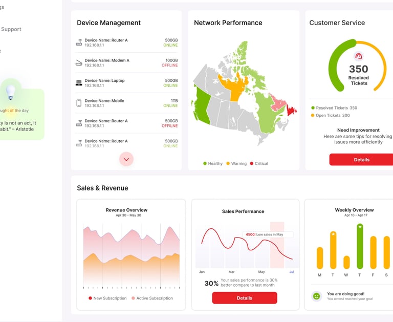
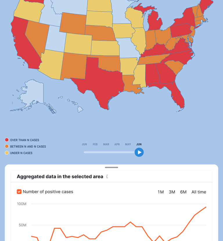
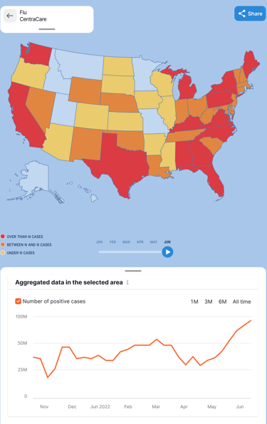
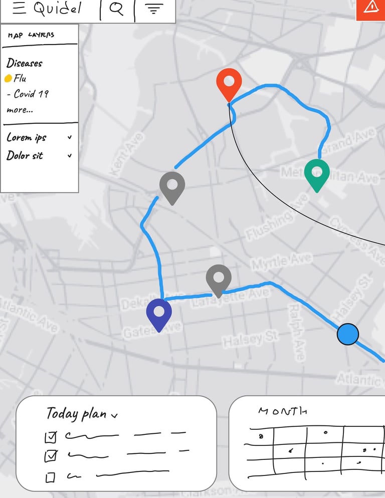
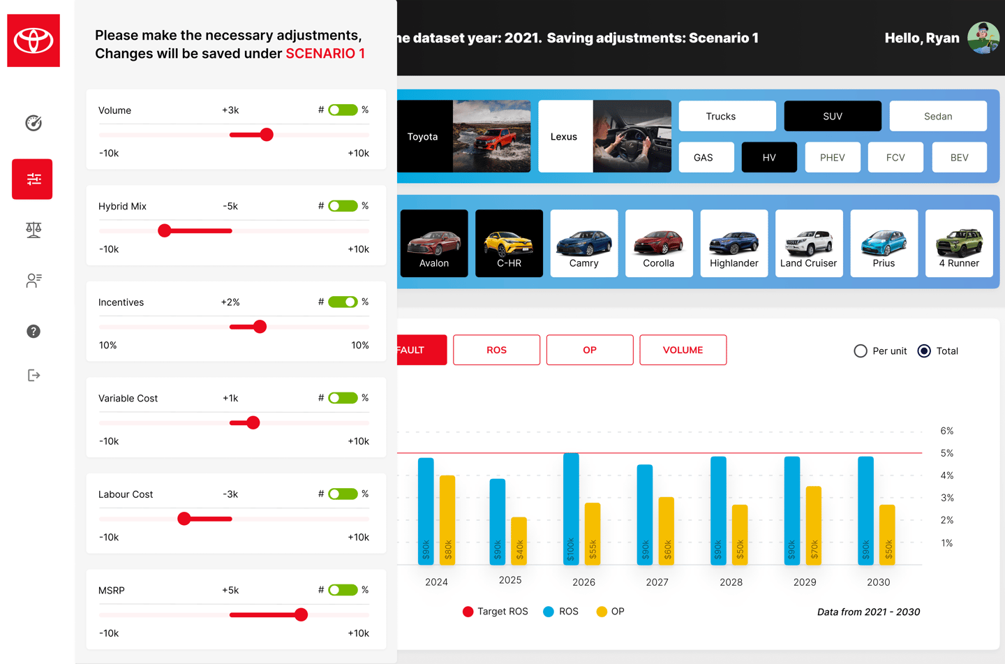
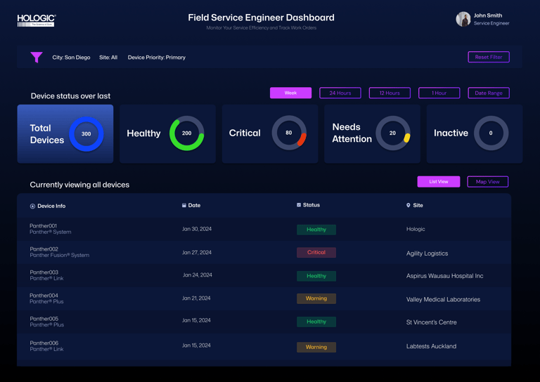
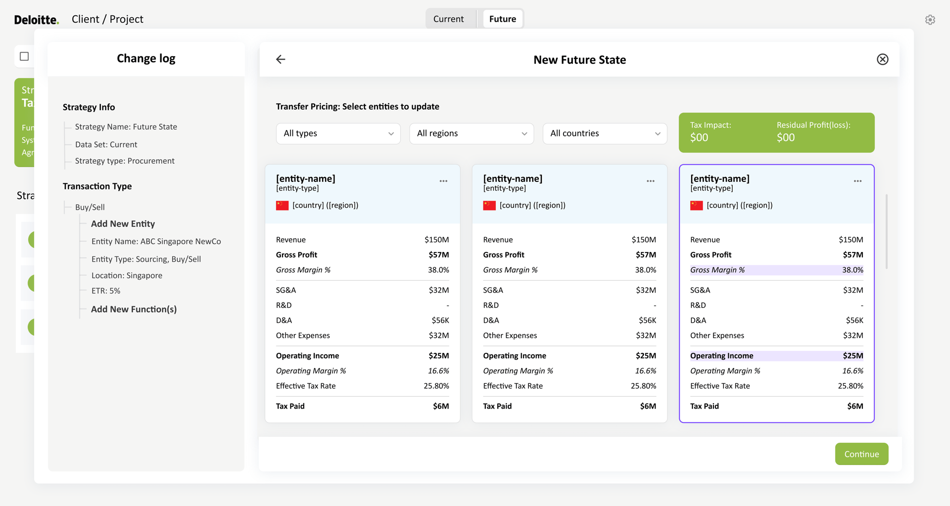
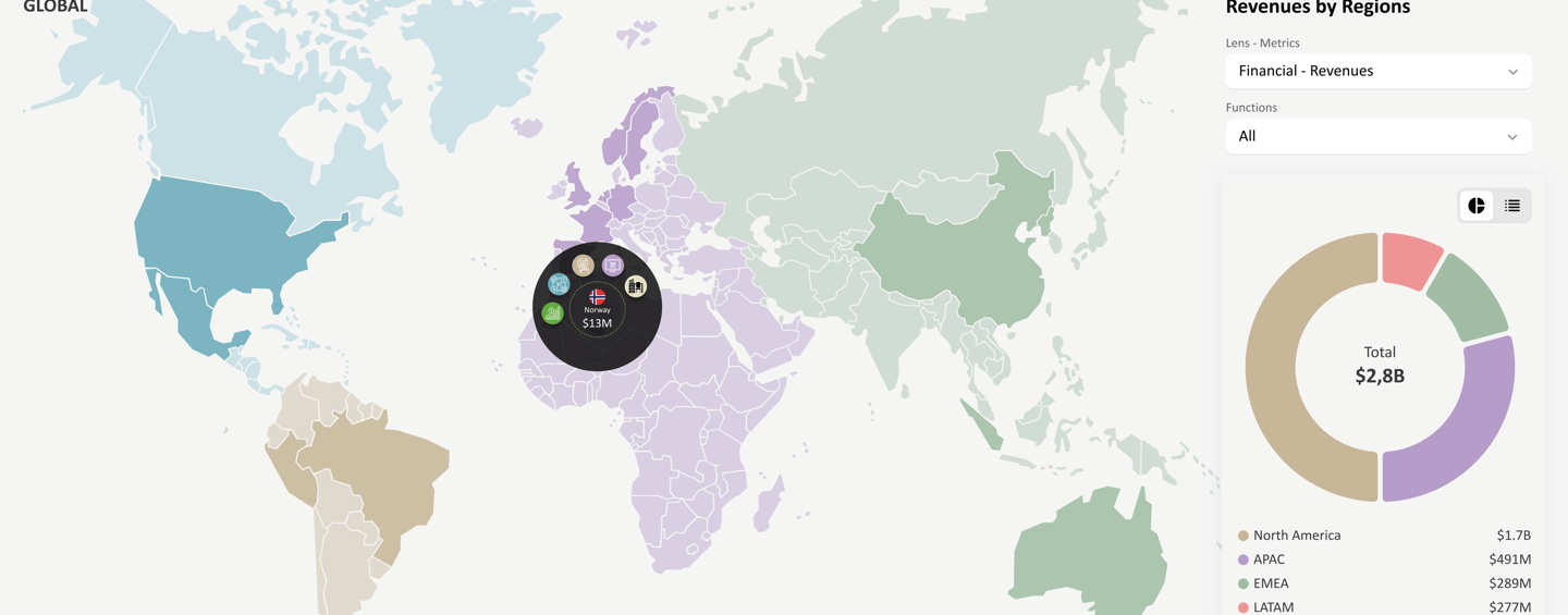
I worked on multiple dashboard experiences across enterprise and consumer platforms that supported complex workflows, large datasets, and critical decision-making. These dashboards were used in healthcare, automotive, consulting, and travel environments, where clarity, accuracy, and usability were essential.
The primary goal across these projects was to translate complex data and system requirements into interfaces that users could understand quickly, trust, and use efficiently in real-world conditions.
The Challenge
Users interacting with these platforms often need to:
Interpret large volumes of real-time and historical data
Navigate multiple workflows and system states
Support different user roles with varying levels of access
Make decisions in high-stakes or time-sensitive environments
The challenge was to reduce cognitive load while maintaining accuracy, flexibility, and scalability across evolving systems.
My Role
As a UX/UI Designer, I was responsible for:
Understanding user needs and decision-making workflows
Structuring information architecture for complex datasets
Designing clear interaction patterns and layouts
Collaborating closely with product managers, developers, and stakeholders
Iterating designs based on feedback, constraints, and evolving requirements
UX Focus Areas
Rather than designing one-off screens, my work focused on repeatable UX patterns that could scale across systems and clients:
Information architecture for complex and layered data
Visual hierarchy and prioritization of key metrics
Designing dashboards that support both overview and deep-dive exploration
Reducing cognitive load for frequent and expert users
Creating flexible layouts that adapt to changing data and requirements
Design Approach
I approached each dashboard by first understanding how users consumed information and what decisions they needed to make. From there, I focused on organizing content in a way that felt predictable, scannable, and intuitive.
Through close collaboration with cross-functional teams, I iterated on designs to balance business requirements, technical constraints, and user needs—ensuring the final interfaces were both functional and user-friendly.


Outcome & Impact
Across these projects, the dashboard designs improved usability and clarity for users working with complex systems. By focusing on structure, hierarchy, and consistency, the interfaces supported faster comprehension, reduced friction in daily workflows, and enabled more confident decision-making across different industries and platforms.
Key Takeaway
Designing dashboards at scale requires more than visual polish—it demands a deep understanding of user behavior, data relationships, and system constraints. These projects reflect my approach to creating structured, user-centered dashboard experiences that remain flexible as products and requirements evolve.